Colour as a Fit Tool: Contrast, Depth and the New Neutrals
- Curve File Editorial Team
- 22 Sep, 2026
The old rule was simple: darker colours make a body look smaller. It is not wrong, but it is incomplete. Colour does not only change width. It also changes where the eye stops, which part of the outfit feels close and which part feels distant, and how clearly the body’s vertical line reads.
Used deliberately, colour can work like a tailor. It can create a waist without a belt, lengthen a leg without a heel and make a soft garment feel more structured.
Value matters more than the colour name
Value is how light or dark a colour appears. A deep burgundy and a pale pink are different values even though both are in the red family. A navy and a cobalt blue can have very different visual weight.
When two pieces are close in value, the outfit reads as one continuous shape. When one is much lighter or darker, a line appears where they meet. That line can be useful or distracting.
If you want a long, continuous line, wear a top and trouser in the same value or a close tonal range. If you want to define a waist, place the contrast at the waist. If you want to break up the hip, let a jacket or shirt end at that point in a clearly different value.
Use contrast to create a deliberate waist
A tucked top in a lighter colour and a dark trouser creates a strong horizontal break. That can define the waist, but it also shortens the torso if the top is very short. A top that ends lower, or a column of tonal colour behind it, keeps more of the vertical line.
A belt is not the only way to create a waist. A short jacket over a longer base, a wrap front, a seam or a change in shine can do the same job with less interruption. This matters when a belt adds pressure or when the waistband is not the part of the outfit you want to emphasize.
The most useful contrast is the one that appears where you want the eye to rest. If the strongest light-dark break is at the hip, that is where people will look first. Move the contrast to the face, the shoulder or the waist if you want a different focus.
The new neutrals are wider than beige
Neutral does not mean only black, white and beige. Chocolate brown, deep olive, slate blue, charcoal, cream and soft grey all behave as neutrals when they are used as the base of an outfit.
A broader neutral palette gives you more ways to build around skin tone and hair without making the whole wardrobe look flat. It also makes sales shopping easier: a strong colour can sit beside several bases rather than only matching black.
When you buy a neutral, check how it looks beside the colours you already wear. A cool grey can make warm rust look muddy. A warm cream can make cool lilac look clearer. The same color can read completely differently depending on its neighbours.
Bright colour does not need to be minimized
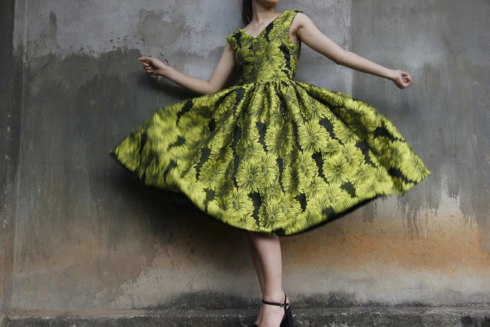
One bright piece can be the anchor of an outfit. A cobalt shirt, a red skirt or a green dress does not need to be balanced by several other bright pieces. Let the rest of the outfit support it.
If the bright piece is large and close to the body, choose a fabric that holds its shape. A bright print or shiny fabric reflects more light and makes folds more visible. A matte woven or a dense knit creates a quieter surface even when the colour is strong.
If you want to wear several colours, keep the values related or repeat one colour through the outfit. A small bag, shoe or scarf in the same family can make the combination look intentional rather than accidental.
Colour at the face changes the whole outfit
The area around the face carries a different kind of contrast. A collar, neckline, scarf or earring can brighten the face without changing the fit of the garment.
This is more useful than the old instruction to wear a dark top and bright accessory. A dark top can be the right base, but a neckline that is too high, too wide or too tight will still create the wrong line. Colour can guide the eye, but it cannot solve a neckline that pulls.
Try the same top with two different scarves, collars or necklaces. Notice which one makes the face look clearer before you notice the accessory. The best option is often the one that repeats a colour already in your skin, hair or eyes, not the one that matches the trousers.
Let the outfit change with the light
Colour is affected by the room, the weather and the time of day. A deep green can look almost black indoors and rich and visible outdoors. A pale grey can disappear against a bright wall. This is one reason an outfit can look good in a fitting room and different at home.
Before buying, take a photograph in daylight if you can. Check where the strongest contrast sits and whether the colour still separates from your hair and skin. If the garment only works in one light, it may still be worth owning, but choose it for the right occasion.
Colour is not a corrective tool. It is a way of editing attention. Once you know where you want the line to read, it becomes as practical as a seam or a hem.
Related reading: Bold Print, Simple Line and Statement Accessories: Change the Line.