Bold Print, Simple Line: The Curve Style Formula That Works
- Curve File Editorial Team
- 28 Sep, 2026
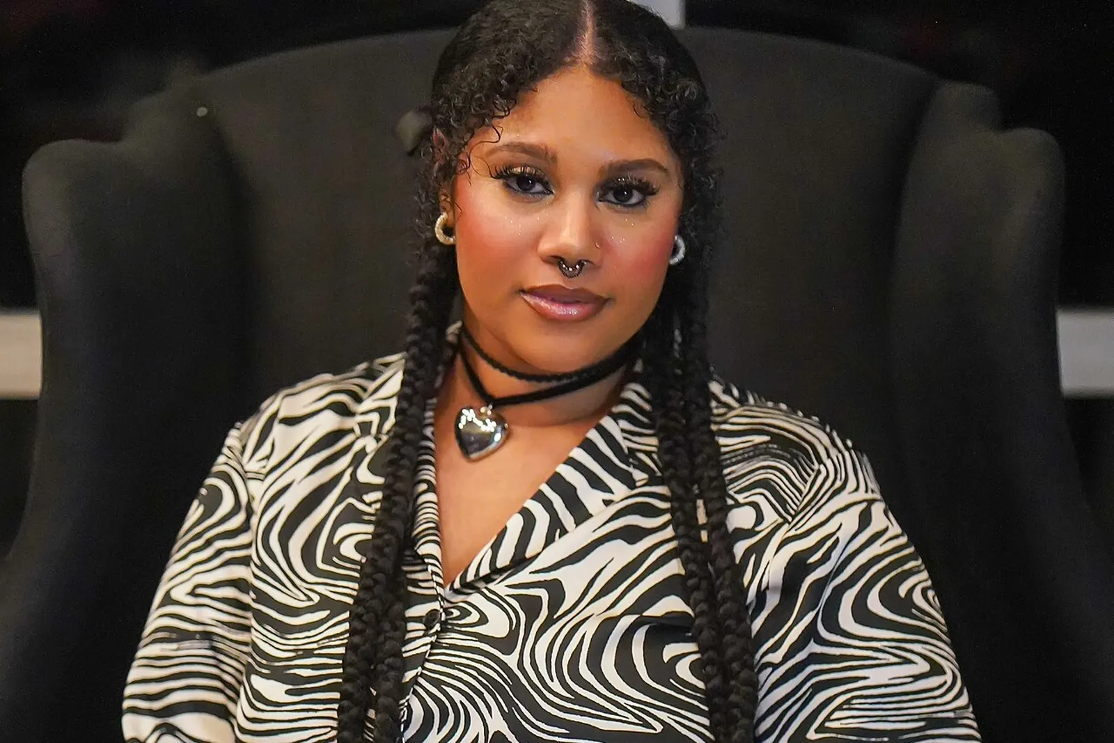
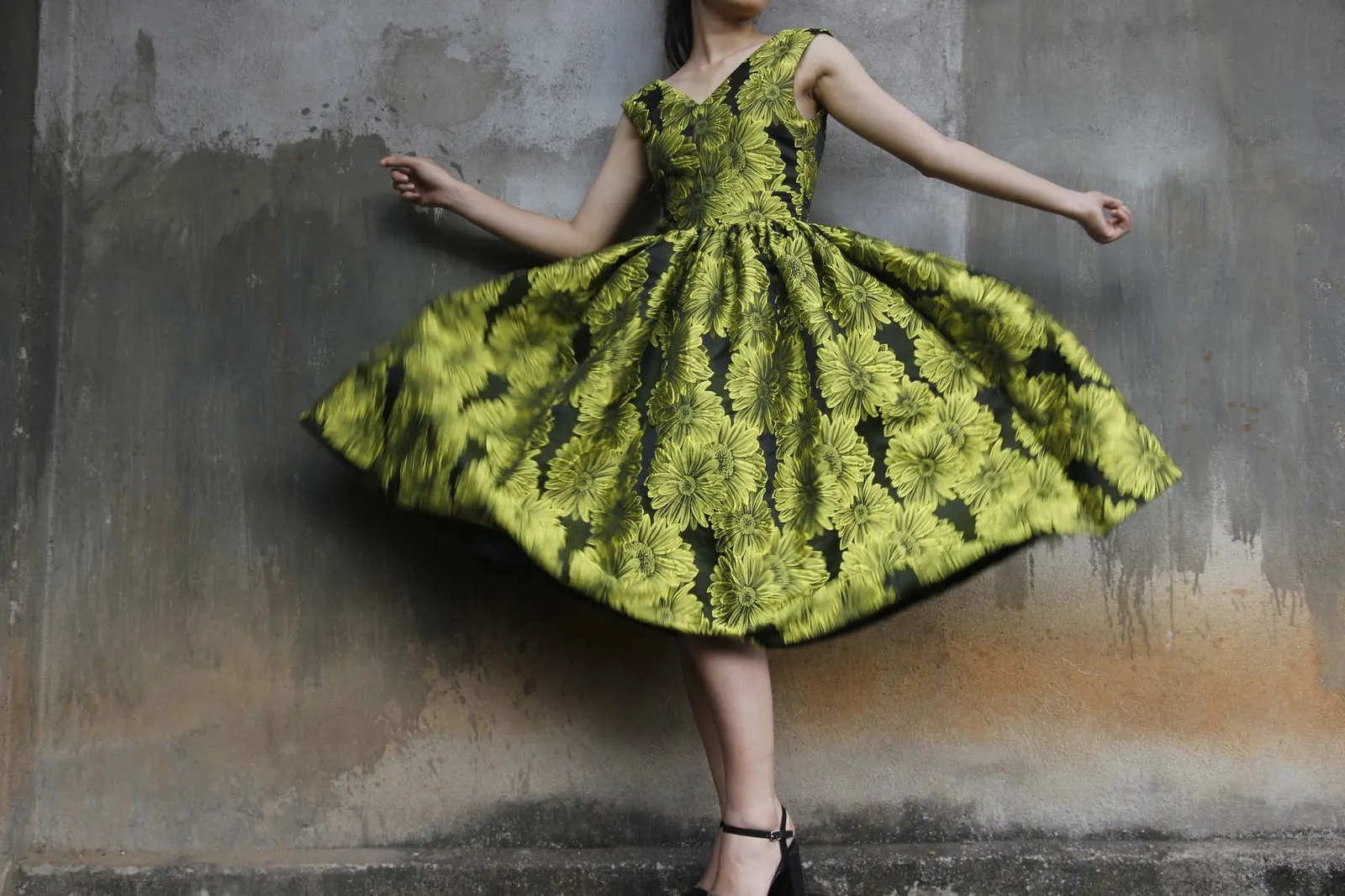
Bold print is often treated as a risk for a larger body. The advice is usually to choose a small pattern, keep it dark and place it where you want to distract the eye. That advice is outdated, and it tends to make clothes look cautious rather than considered.
A print does not make a body look larger on its own. What matters is the scale of the pattern, the amount of contrast, the direction in which it moves and the shape of the garment carrying it. Once those four things agree, strong pattern can make an outfit look clearer.
Let the garment line stay simple
The easiest way to wear a large print is to give it a simple silhouette. A straight shirt, a clean column dress, a bias skirt or a wide-leg trouser gives the eye a clear outline. The print supplies energy; the cut keeps the outfit readable.
This is why a bold blouse often works better with a plain trouser than with a printed skirt. You are not banning pattern. You are stopping two patterns from arguing over the same amount of visual space.
If you want two prints, connect them through color or scale. A large graphic print and a narrow stripe can work when both share a base color. A large abstract print and a small floral usually do not, because the two patterns compete without giving the eye a rule.
Scale is about the whole body, not the bust
A print repeats across the entire garment. A small motif looks busy when it is stretched over a large area, because the eye sees more repeats. A large motif can look calmer because each element has room to read.
That is why a large-scale print is often easier to wear at plus sizes than a tiny ditsy floral. If a print feels noisy from a metre away, step back rather than deciding it is wrong for your body. The same image may read as elegant once the repeats are larger and fewer.
The exception is a print with very high contrast and a complicated edge. A large motif in black and white can be stronger than a similar motif in blended tones. In that case, let the garment silhouette be quieter and choose accessories that do not repeat the same visual rhythm.
Contrast creates the line
Contrast is the difference between the lightest and darkest parts of the print. High contrast draws attention to the pattern. Low contrast lets the color and the cut carry the outfit.
If you want a print to feel soft, choose colors close in value: navy and blue, rust and brown, cream and sand. If you want it to feel graphic, choose a clear light and dark. Neither is inherently more flattering. They simply create different amounts of visual movement.
Placement matters next. A large motif over the bust, waist or hip creates a focal point at that place. That can be exactly what you want. If it is not, look for a print that is broken by a seam, a panel or a change of scale rather than trying to hide the area with a loose layer.
Direction changes the proportion
Vertical lines can make a garment feel longer. Horizontal lines can make a section feel wider. Diagonal lines create movement and can keep a large print from looking too static.
These effects are useful, but they are not absolute. A horizontal stripe across a wide leg trouser can give a crisp break and make the hem look intentional. A vertical stripe on a shirt can make the front feel neat even when the fabric is relaxed.
The most reliable rule is to notice where the lines run. If they point toward a detail you like, keep them. If they pull your eye toward a seam that is straining or a hem that sits awkwardly, the print is exposing a fit issue that a different garment cut may solve.
Match the pattern to the fabric
Print and fabric cannot be judged separately. A large print on stiff fabric holds its shape and reads more graphic. The same print on fluid fabric moves and becomes softer.
A dense print on a stretch jersey will often look more body-conscious than the same print on a woven shirt. A printed satin can look fluid and formal, while a printed cotton poplin keeps a cleaner architectural line. Choose the behavior you want before you choose the motif.
Look at the seams too. Pattern matching at the center front, side seams and bust darts is a sign of careful cutting. It is not a requirement for every print, but a mismatched prominent motif can make a well-fitting garment look less expensive.
Build the outfit around one strong decision
Start with the printed piece and decide what it needs. If the print is bright, use a neutral that appears in the print rather than adding a new color. If the print is tonal, you can build with a deeper shade of the same family. If it is graphic, keep the shoes and bag simple.
Jewellery can repeat the scale. A large print often works with one bold earring or a substantial chain, while a fine print can take several smaller pieces. The point is not to make everything match. It is to create a clear hierarchy.
Finally, try the printed garment with the trousers, skirt or layer you already wear most. A print is not a costume. It is most useful when it makes the clothes you already rely on feel different without forcing you to buy a whole new outfit.
Related reading: Colour as a Fit Tool and Statement Accessories: Change the Line.